
Turn Into Pill Button
Summary Block
Featured


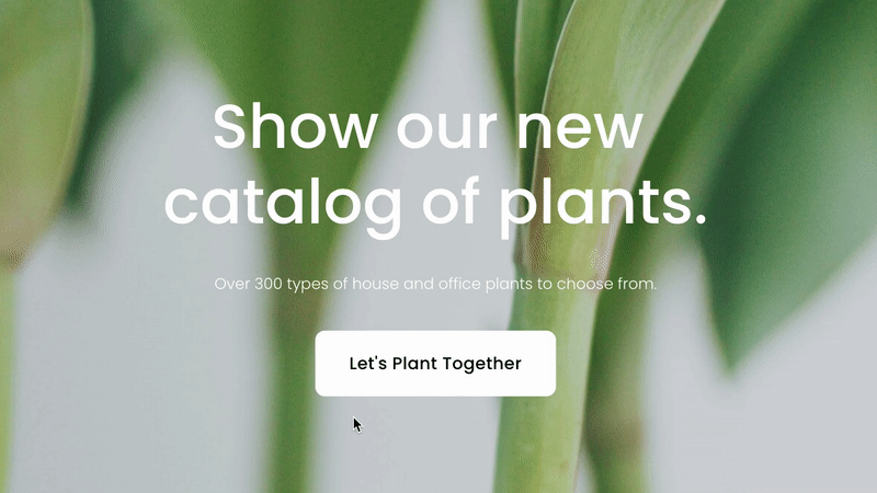
Look Demo
Turn any button block into pill shape when hovered. This plugin uses css editor and works with all template families.
How To Install
Add a button block to any page. You can set the size to whatever you like.
Once a button has been added and saved, go to the Custom CSS Editor. Copy and paste the code below into the Custom CSS Editor box.
// Square To Pill Button //

.sqs-block-button .sqs-block-button-element--medium {
  border-radius: 10px;
  -webkit-transition: ease-in-out 0.5s !important;
  -moz-transition: ease-in-out 0.5s !important;
  -ms-transition: ease-in-out 0.5s !important;
  -o-transition: ease-in-out 0.5s !important;
  transition: ease-in-out 0.5s !important;
}

.sqs-block-button .sqs-block-button-element--medium:hover {
  border-radius: 50px;
  -webkit-transition: ease-in-out 0.5s !important;
  -moz-transition: ease-in-out 0.5s !important;
  -ms-transition: ease-in-out 0.5s !important;
  -o-transition: ease-in-out 0.5s !important;
  transition: ease-in-out 0.5s !important;
}
Customize
The code works for the medium button block. If you want to modify a small or large button, replace all .sqs-block-button-element--medium text with either .sqs-block-button-element--small or .sqs-block-button-element--large.
You can adjust both of the border-radius values to your liking if you or keep as is.
License
This plugin comes with an Unlimited Use License. View License Terms
Summary Block
Featured

Donec id justo non metus auctor commodo ut quis enim. Mauris fringilla dolor vel condimentum imperdiet.